Showing posts with label Colours of the |Earth Natrual dye recipes by Helen Melvin. Show all posts

Monday, 15 June 2009

Woolfest. Panic! What Panic ! EeeeK!


I am totally freaked out by another blog author saying she was ready for Woolfest bar a few bits and pieces. While DH decorates the sitting room following the installation of the wood burner & solar panels, clears a place in the garden for the new summer house, and plants our new Dye Trees ( Birch Betula Pendula....Wig or smoke tree Cotinus Coggrgria. .... Choisya Ternata Mexican Orange blossom .........I potter around with a furrowed brow trying to fit lots of different events together. For the Woolfest I have two major new products. One is my new book "The Colours of the Rainbow, Painting Fibre and Fabric with Extract Dyes." I have been trying to write this for two years and then decided that the only way to do it was to get up early and write every morning. It is not very early only 7.30am but DH is a dormouse in the morning and if he is not working he snoozes peacefully till 9 am. If he is working he does not get home till 10am so one way and another I have managed to write it. As I wrote it I kept identifying gaps in my samples so off I buzzed to the studio to do some dyeing. Mostly what I needed was what I call batch dyeing -dyeing lots of multicoloured fibre and fabrics in one go in a large pan. Well of course this is not only an opportunity to do some nice samples but I need to make more samples for summer school at Lincoln for the National Association for Weavers Spinners and Dyers where I am teaching ( along side extract dyeing) making a fine felt stole from 18.5micron merino So I took the opportunity to dye myself some multicoloured merino and also of course for Woolfest. Into my batch dyeing went fabrics- muslins,. chiffons and organzas-This is because I am involved in a very exciting event next October "The Real Colour Show" . (More soon)
Into my panic stricken brain zips the reminder of my other new product. These are my new Fabric Paints. I had these for the first time at my Open Day on May 30th I did not make many- just five pots of each colours but they all sold and of course I need to make a whole new lot for the WoolFest -phew! This means to make up the paints ,print off the labels and fill and label on the pots. Are you feeling tired reading this! On top of that is making more inks as they are generally selling well and although they did not sell well at the Woolfest last year they might this year. A college wants me to send details of my new course-you guess it-as a matter of urgency please. Someone asks me for a course next year-very gratifying as it means I am now booked up till next June- but they want a variant on my written workshops so I need to write a blurb and work out pack costs.
Why I am writing this blog! I don't know except it clarifies my mind to write it all down.
Back to the book. It needs to be edited,printed and given to DH who will go through it with a fine tooth comb and pick out anything I missed. As he is doing an OU degree in Law it means fitting this in with with what he is doing . Then I need to hand paint the covers, finish the design for labels, print them off and print the book and put together. I am very behind with my accounts Oh woe!
And get ready for the Woolfest
Ready ! You must be joking!

Photos are results of batch dyeing. They are in oranges greens and pinks and lilac and are a homage to Michelle Obama who wore a skirt in these colours while visiting Westminster Abbey. (and two cardigans as it was rather cold! I so admire her style)!

Wednesday, 26 November 2008

Peacock blue

Posted by Helen
Welcome to Sarah and Twisted Sister as new followers of the blog. It is nice to know you are enjoying the blog but please do leave comments-they make my day. :)


I am very excited as I am dyeing a lovely range of colours using indigo sulphonate. Enys when she arrived for her gardening stint - in this case cutting down the Cosmos and lots of cups of coffee, said to me that the colour was peacock blue. I had said it was a dark turquoise but in fact I think she is right. Where is it you might ask? Well the problem is the difficulty of photographing natural dyes. It is often a problem but is particularly so when I have used more than one dye as I have in this case- indigo sulphonate and persian berries. My first attempt at photographing looked a dingy blue. I put it alongside some indigo dyed fibres and it looked even worse. I tried it bracketed with green and with blue -still no good. another friend suggested putting it alongside a cochineal red. This is better and is the one you can see above but the real beauty of the colour does not come across. This is so frustrating. I tried on my website putting up a photo of some merino dyed in madder and logwood and it simply looks dark blue whereas it is the most beautiful dark purply bronze. I have been told by some people who come to my workshops that the colours on the website simply don't do justice to the colours in the flesh as it were and I agree. It seems to be something to do with the complexity of the colours. So for the moment you will have to take my word for it the colour I have got from my indigo sulphonate is fantastic.


I am happier with my new book covers , made with the paper I painted with my new bronze and blue inks. I think they look striking and Iam happy with them.

Tuesday, 18 November 2008

New Natural Dye Inks: blue and bronze

Posted by Helen
Welcome to some new followers of my blog Yvette, Willington Weaver( Hi Alison) Mollys and Martine.


I have been busy making new ink colours. The inks have been a bit quiet or rather the sales of them have been quiet but have suddenly started to pick up. Every time I ran a workshop someone would buy a set of 5 or 8 and people have been coming back for more and like ripples in the pool they have been getting to a wider audience. Two local artists , amongst others, have been using them; David Brightmore and Jan Gardner. It was David who started me off on the journey of actually making inks rather than concentrated dye baths, which I had been using and tells me that he has sold some of his pictures painted with my inks and he has also been back for more.
Last week Debbie Bamford went off to the original reenactors market at Coventry taking with her my medieval inks; a medieval black, yellow and red, the black and the red being new. She sold a few and says that there was a lot of interest, but it takes time for people to buy something new: it is seems so odd to hear my medieval inks described as something new as the very name makes them sound antique and you would expect re-enactors to leap on them with cries of joy, especially as Debbie sells quill pens, but apparently not, apart from a discerning few. In the meantime having a few days free between the end of one set of workshops and the next series in Jersey I decided to bite the bullet, gird my loins and face the challenge of blue. The reason for the girding of the loins part is that I thought the only way to make a good blue was by going via saxon blue. Saxon blue is in fact indigo sulphonate which is indigo dissolved in concentrated sulphuric acid. I was a bit concerned about using this as my memories of A level Chemistry were rather in a dim and distant past , but one of the people who came to my last workshop on mitten making is Pam who teaches Chemistry . She went through safety procedures with me so on Sunday I made some indigo sulphonate wearing goggles, face mask, vinyl gloves and old clothes., stirring finely ground natural indigo slowly and carefully into a measured lot of concentrated sulphuric acid. It had to be left for two days but today it was ready for use so I experimented with making it up into an ink and here is the result.


The first is a weak concentration and the second a higher concentration . The texture on the surface is the paper's (I think) which is a heavy weight rough textured paper 425not- i.e paper that has not been either hot or cold pressed to give a smooth surface. However I was a little concerned about the look of that ink so when I made up the full amount I made sure that the thickener was very well dissolved and smooth.


My next ink is a bronze. I have long been wanting a bronze. The recipe I have for bronze ,which I found in Dominique Cardon's book Natural Dyes, and which apparently was designed for the Marquis de Pompadour, the husband of the courtesan Madame de Pompadour mistress to Louis XVth. The recipe was for brazilwood and weld and I used a variation of it for the fibres for the felt bronze bell which I made with the children of Bodfari school. I was really pleased with the colour . I have been trying to replicate this in ink but it had not worked but after a lot of experimenting using a combination of three dyes I made a bronze I liked. I am not going to say exactly what the dyes are -a girl's got to have some secrets- and after all I do sell them, but above you can see the result . The painting in the blue and bronze is a sheet of watercolour paper destined to make five covers for my dye books which continue to sell steadily. One of the things I really liked is the interaction the blue and the bronze, sometimes it went a very gorgeous green , but a tiny bit of blue on the brush made the bronze go into different bronze colours. Quite yummy in fact!


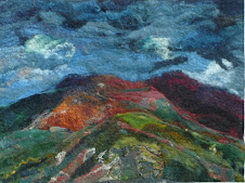
I noticed that India Flint describes herself as a mark maker which description I like very much and wished I had thought of-sigh- It occurred to me that what I do when I make my dye book covers is not painting but making marks and above is another also in bronze and blue but using different brushes and marks. Finally I have put in one of my pictures- a design for felt which never happened as when I tried to translate it into felt it did not work, but I like the painting.