

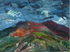
 Those of you who have been following my blog will know that I have been playing around with making natural dye inks ever since a local artist David Brightmore http://www.davidbrightmore.com/ asked me to make him a set of inks from natural dyes a few months ago. I have had the inks on the back of my mind for a fow weeks and earlier on this week made space to make some of the traditonal recipes. I first made two "blacks" the first the traditional gall nut ink the second a later in time ( 1800's) slightly more complex one with logwood, and sugar. Then I embarked on the brazilwood reds the traditional source of most red inks up until the the 1920's. I made two the second of which I used in the pictures are with the brazilwood extracted in acetic acid. This latter recipe I found on the net in Henrietta's Herbal Page http://www.henriettesherbal.com/ .
the blacks from David Carvahlo's book 40 centuries of ink. published by http://www.echo-library.com/ ISBN 1.406844136. Browsing through Dominique Cardons Book Natural Dyes I came across a reference to fermented persian berries being used to make a green paint and then felt that I really wanted to make a set of dyes quickly having got into the swing of it, and not wait around for a week or so to ferment the berries so I made up a concentrated solution of the extract of rhammus berries and made an ink with that. That is the yellow. I have been playing around with making paints, it is these that I use to paint the covers of my dye books, for years but had not found a good strong yellow to paint with except saffron. So I was extremely pleased to find that the persian berry extracts made a really strong yellow. The final colour the green is made with an extract called "green" surprisingly enough and this is apparently extracts from various plants. This I also made up into a a strong solution and made an ink from that. Then I painted a picture! I am pleased with them with some reservation. I had hoped that the brazilwood would be redder and the black is really a charcoal grey,nice to use in a paint but not quite dark enough for writing. However I have got the hang of making inks and for my own purposes ,which is to paint pictures as a starting point for my felt landscapes , I am more than happy with them and think I will try the cochineal red apparently more brilliant but less lightfast and purple. I have put samples of ink painted onto card in my southwest facing window for a month so will see how these fare lightwise.
Oh! and the blue on the right hand side is not an ink but a thickened ( with gum tragacanth) indigo concentrate.


Great links! Looks like your research is paying off, the colors are wonderful.
ReplyDeleteFabulous colours, thanks for sharing.
ReplyDeleteI do like the colours, you have made good progress, it's fun to be out here watching.
ReplyDeleteI hope they prove reasonably good in your light-fast test.
These look absolutely stunning!
ReplyDelete