
Welcome to Sarah and Twisted Sister as new followers of the blog. It is nice to know you are enjoying the blog but please do leave comments-they make my day. :)

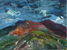
I am very excited as I am dyeing a lovely range of colours using indigo sulphonate. Enys when she arrived for her gardening stint - in this case cutting down the Cosmos and lots of cups of coffee, said to me that the colour was peacock blue. I had said it was a dark turquoise but in fact I think she is right. Where is it you might ask? Well the problem is the difficulty of photographing natural dyes. It is often a problem but is particularly so when I have used more than one dye as I have in this case- indigo sulphonate and persian berries. My first attempt at photographing looked a dingy blue. I put it alongside some indigo dyed fibres and it looked even worse. I tried it bracketed with green and with blue -still no good. another friend suggested putting it alongside a cochineal red. This is better and is the one you can see above but the real beauty of the colour does not come across. This is so frustrating. I tried on my website putting up a photo of some merino dyed in madder and logwood and it simply looks dark blue whereas it is the most beautiful dark purply bronze. I have been told by some people who come to my workshops that the colours on the website simply don't do justice to the colours in the flesh as it were and I agree. It seems to be something to do with the complexity of the colours. So for the moment you will have to take my word for it the colour I have got from my indigo sulphonate is fantastic.
I am happier with my new book covers , made with the paper I painted with my new bronze and blue inks. I think they look striking and Iam happy with them.


Helen,
ReplyDeleteI am teaching students in my basic design about color right now...and you are correct in that a color next to another color can really enhance (or not) another hue.
I love the colors on your journals! Great marks and patterns. I am inspired.
Patricia Kessler
thank you-what course do you teach?
ReplyDeleteI love the bronze ink too
ReplyDeleteis it for sale??
can you do me one of those payment thingy's
memory loss is setting in early
give me a mo
Ahh Paypal
I was always taught that putting a colour next to its complementary colour makes both colours seem more intense. So I guess the complement of peacock blue would be an orangey red.
ReplyDeleteI agree though. Getting the colour right in images is extremely difficult.
We are winding up the semester next month and I will finish up the basics, 2-dimensional design and also basic drawing. Next semester I will teach a course in watercolor and also design. I teach in a local community college (two year school)to a wide range of student, mostly non-art students.
ReplyDeleteI take your word for it Helen the color is fantastic! Right now i'm making a list about the dyeflowers i need for my garden in spring. Can't be a long list for my garden is tiny. Searching your blog for it.
ReplyDeleteXXX
Helen, I have the same problem all the time. I think the lighting is very important when taking pictures. bright sunlight is a no-go - but flashes on cameras usually change the colours too. I read that you should build a "diffuser", a white cardboard box or similar - and use two daylight lamps instead of flashes to eliminate shadows. all well in theory - but I am far too impatient for that when taking pix and don't fany setting up a studio every time I want to take one:)
ReplyDeletethe colours still look nice, though!
Just a note to say I enjoyed reading this, and the blue is obviously very rich and lovely, whatever the exact shade. The way it photographs is probably down to the colour (temperature) of the light - are you photographing by daylight or by flash? My fancy Canon SLR has a menu function to adjust the "white balance" - this enables the photographer to compensate for the colour tint in the light source (not many light sources are pure white, most have a bias towards yellow, some "daylight" bulbs are blue tinted).
ReplyDeletePhotographing fibers and textiles for color accuracy is difficult. Even so, they look luscious. And the book covers are fantastic! Very nice indeed.
ReplyDeleteHello Helen,
ReplyDeletegreetings from Down Under,
as a teacher I am busy writting end of year reports, will get back to your inks next week ... when life is back to some normality.
I am fascinated by the felting, collecting at the moment to get startet after the heat in february, I can see the use of your inks there... will work it out.
Ciao until later
Madeleine
PS: To the Followers comments: you can get a complimentary colour wheel in most art shops, and yes the right colour combination makes them sing....
Thanks for the camera comment, need a new one (SLR) soon, but not Canon, they are too heavy